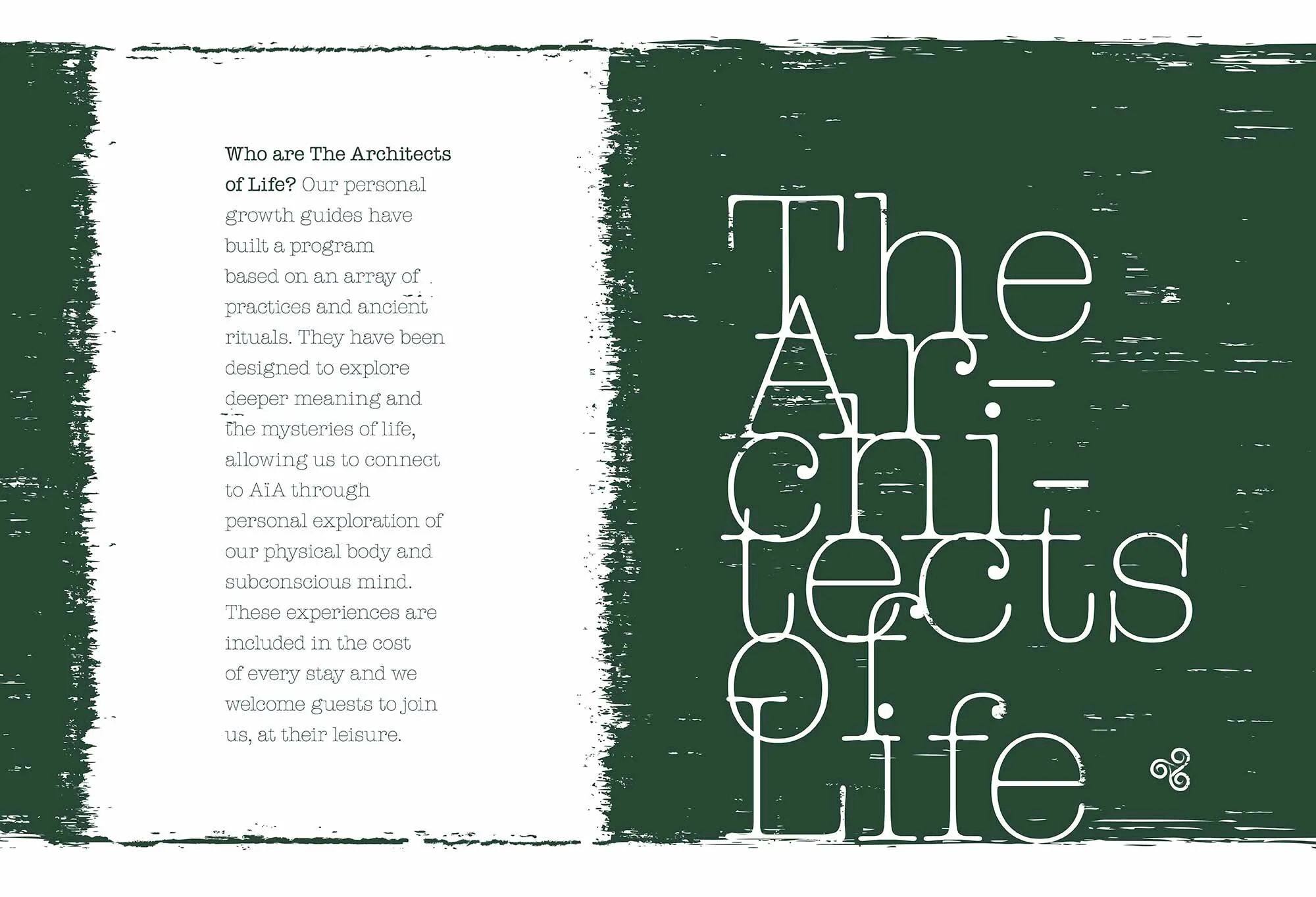
Brand Design for The House of AïA
The sacred feminine as a vehicle for nature.
Core Brand Update
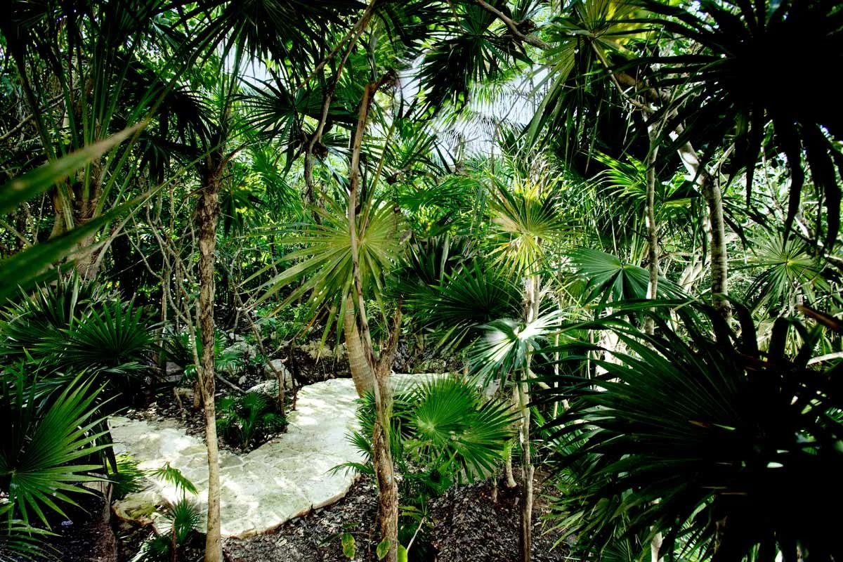
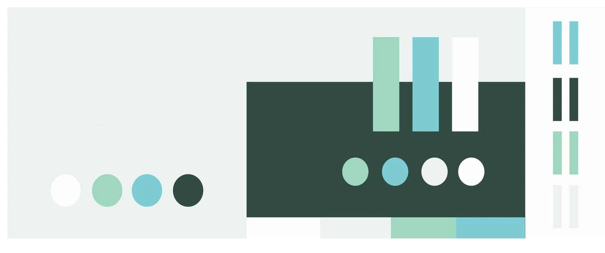
Colors inspired by the Caribbean shore.
Logo refresh, where I enhanced the previous mark and added The House of AïA as the mother brand below the existing hotel name.
The mark was updated as a reversible acorn that flips over to reveal a shape inspired by the Venus of Willendorf: a metaphor that nature emerges from the feminine, and vice-versa.
A thin Slab Serif typeface that is reminiscent of the Belle Epoque and The Grand Tour.
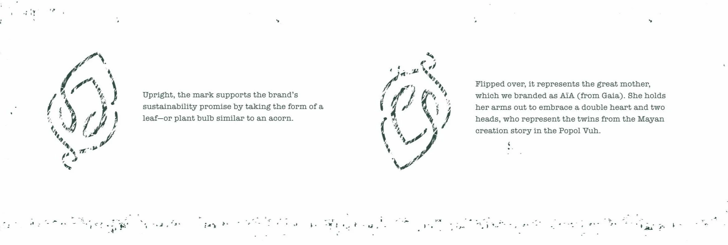


The Venus of Willendorf dates from circa 25,000–30,000 B.C.

The mark applied to a pendant design.
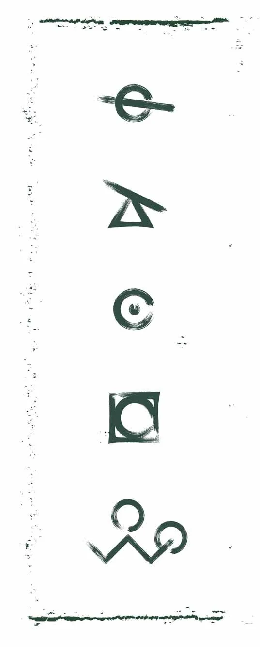
Cuneiform Symbols
I created a series of symbols to explore the brand through cuneiform, strengthening its association to ancient practices. We used a stroke style that is both on-brand and easy to replicate, so the in-house team could add more symbols as needed.


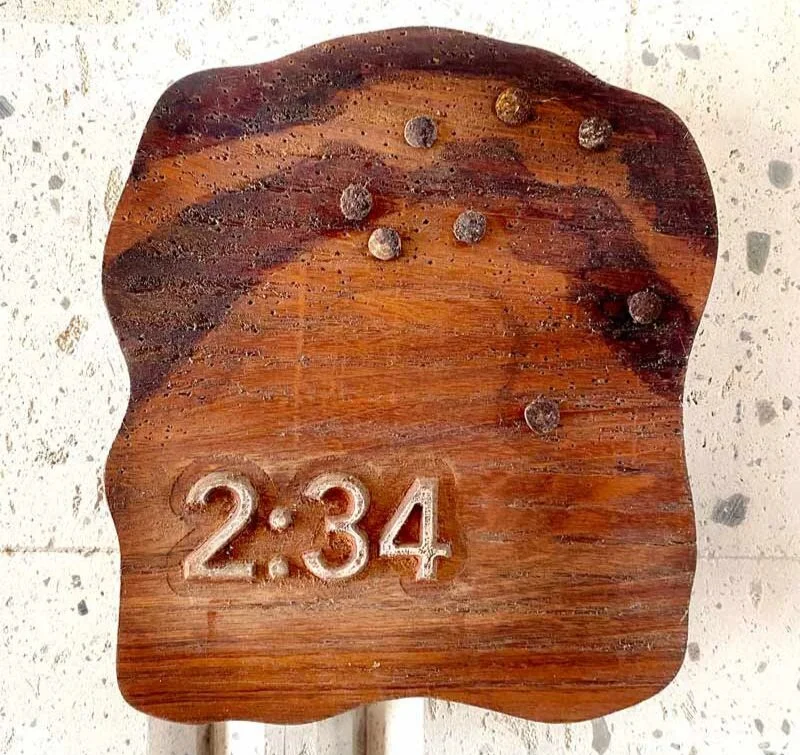
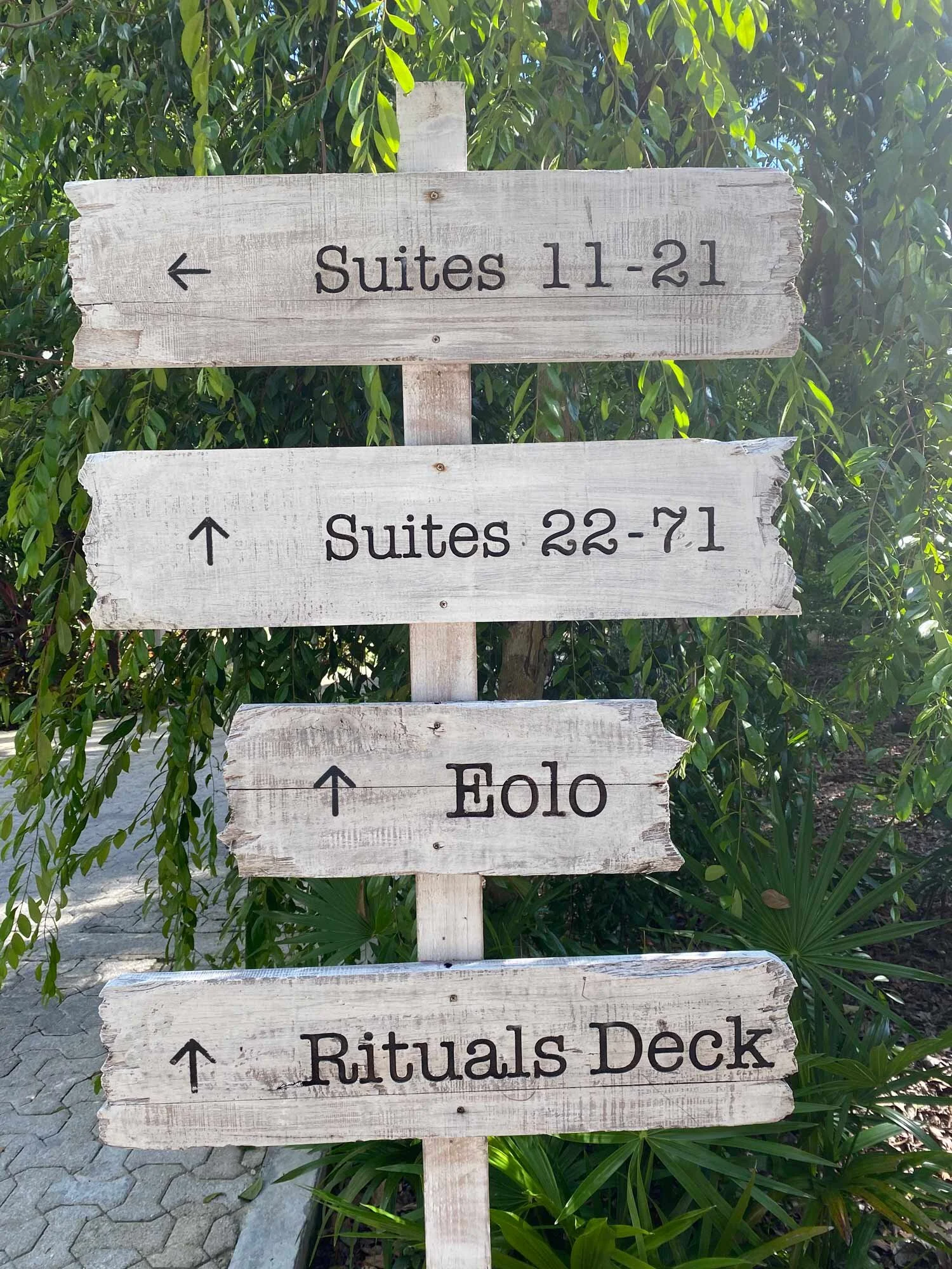
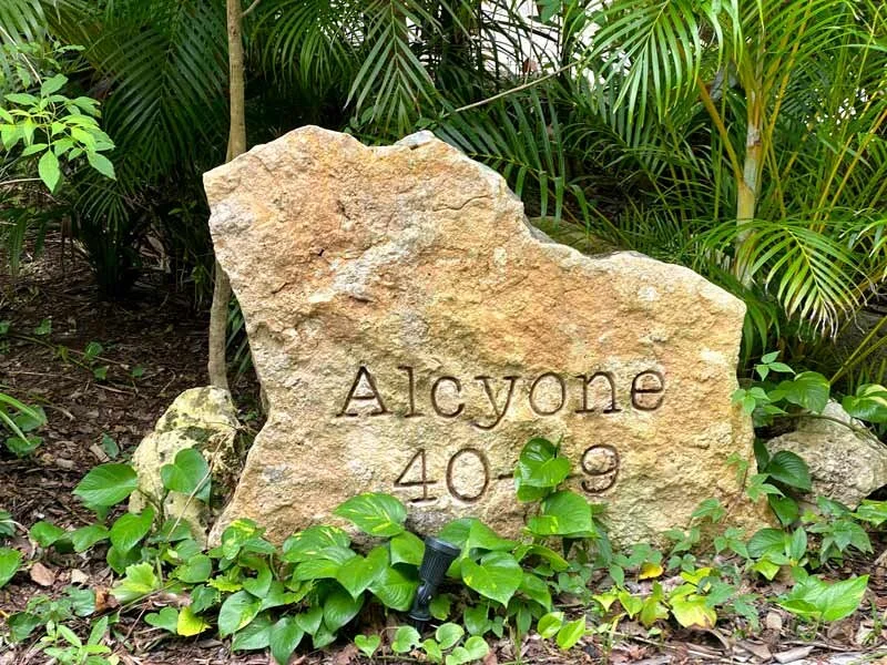
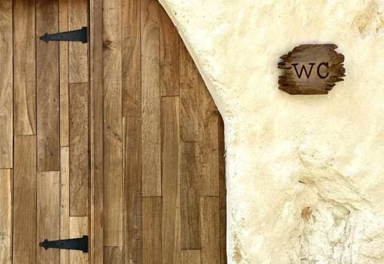
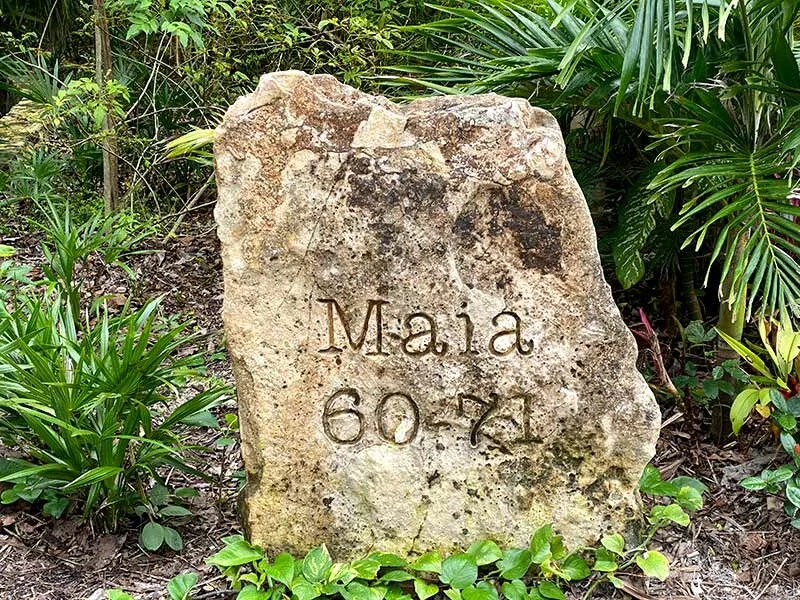
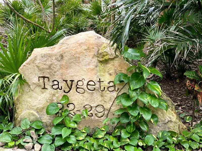
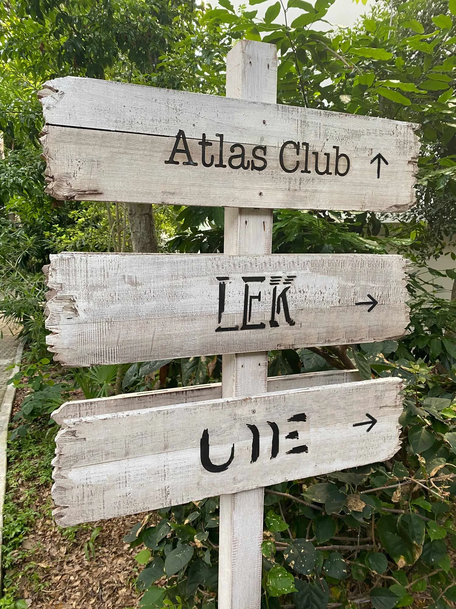
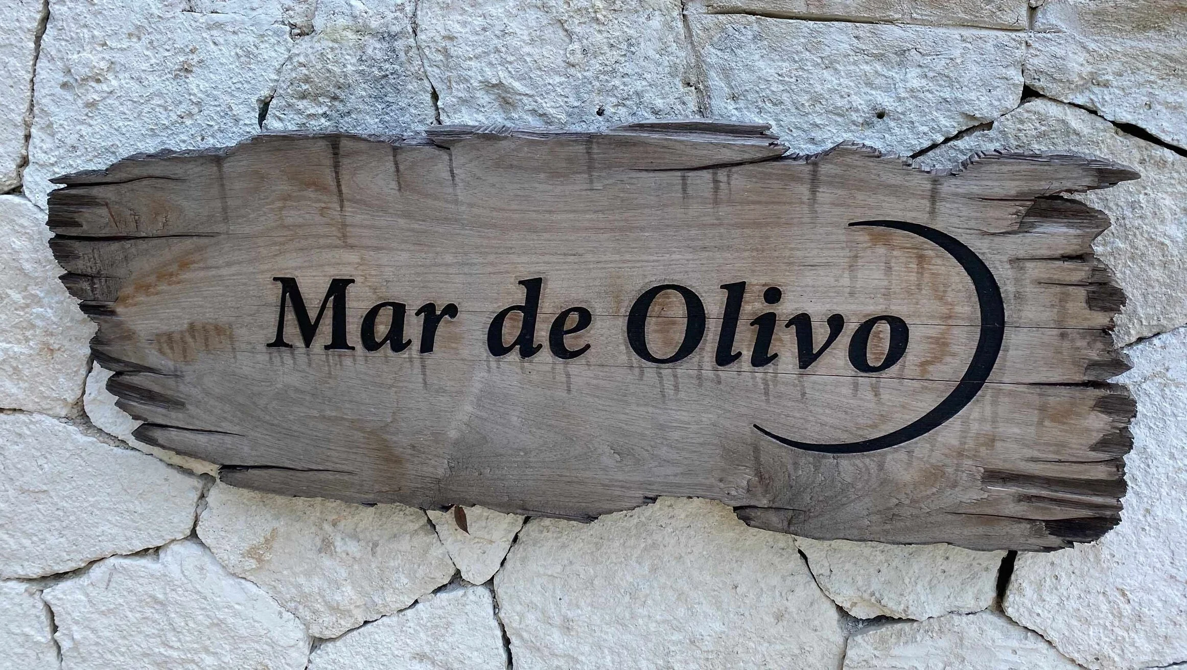
Logos & Signage
Logos for three on-property restaurants, room number signs, and other signage.