Brand Design for The House of AïA
How to create a luxury resort brand with proximity to nature.
We named the parent brand The House of AïA which evokes the sacred feminine through a brand-able representation of Gaia (a common term for mother earth).
This let us explore the hotel’s plant-based food, wellness, sustainability, and children’s programs with narratives that held a connection to nature.
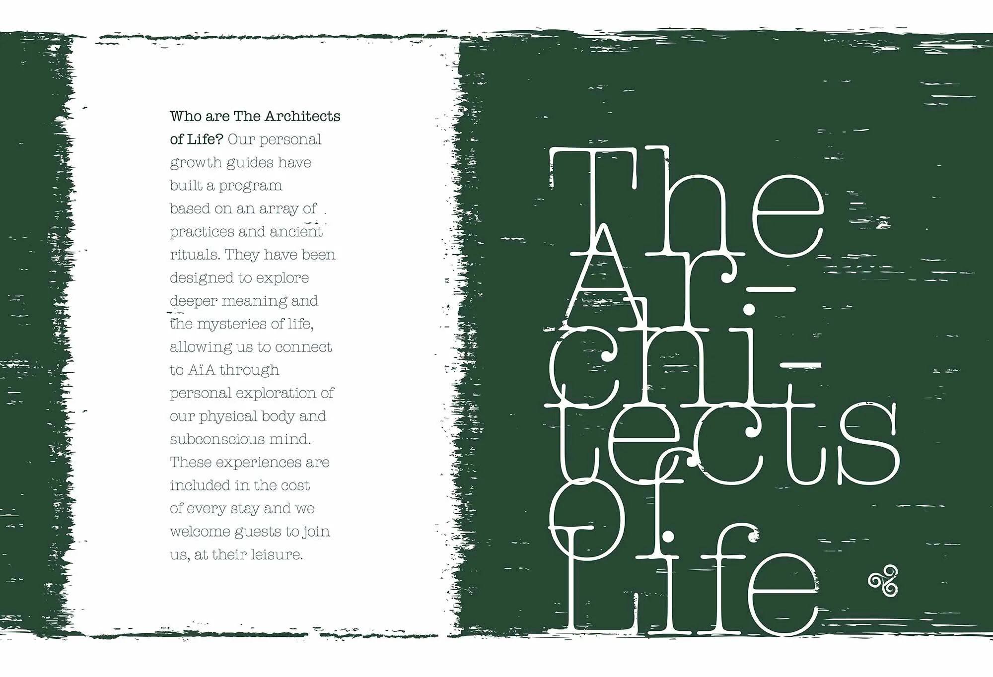
Additionally, we proposed the The Architects of Life as a name for the yoga program, which led to re-positioning the property as a wellness offer.
Core Brand Update
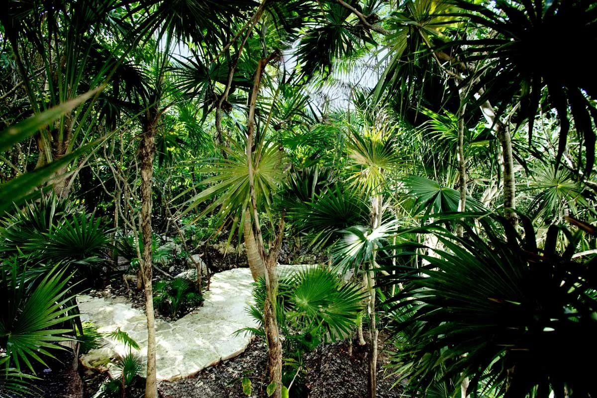
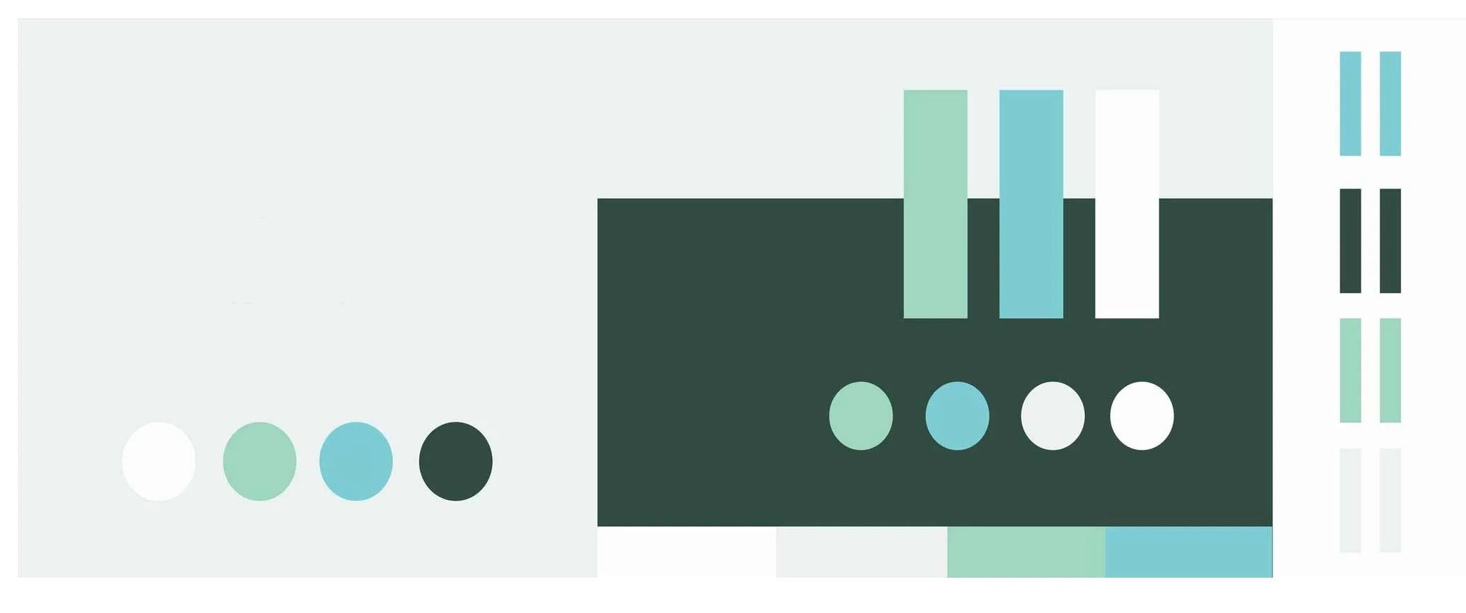
New colors inspired by the natural Caribbean shore.
Logo refresh, where we enhanced the previous mark and added The House of AïA as the mother brand below the existing hotel name.
Slab Serif typography that is reminiscent of simpler, more mechanical times.
The mark was updated as a reversible leaf (or acorn) that flips over to reveal a shape inspired by the Venus of Willendorf: a metaphor that nature emerges from the feminine, and vice-versa.
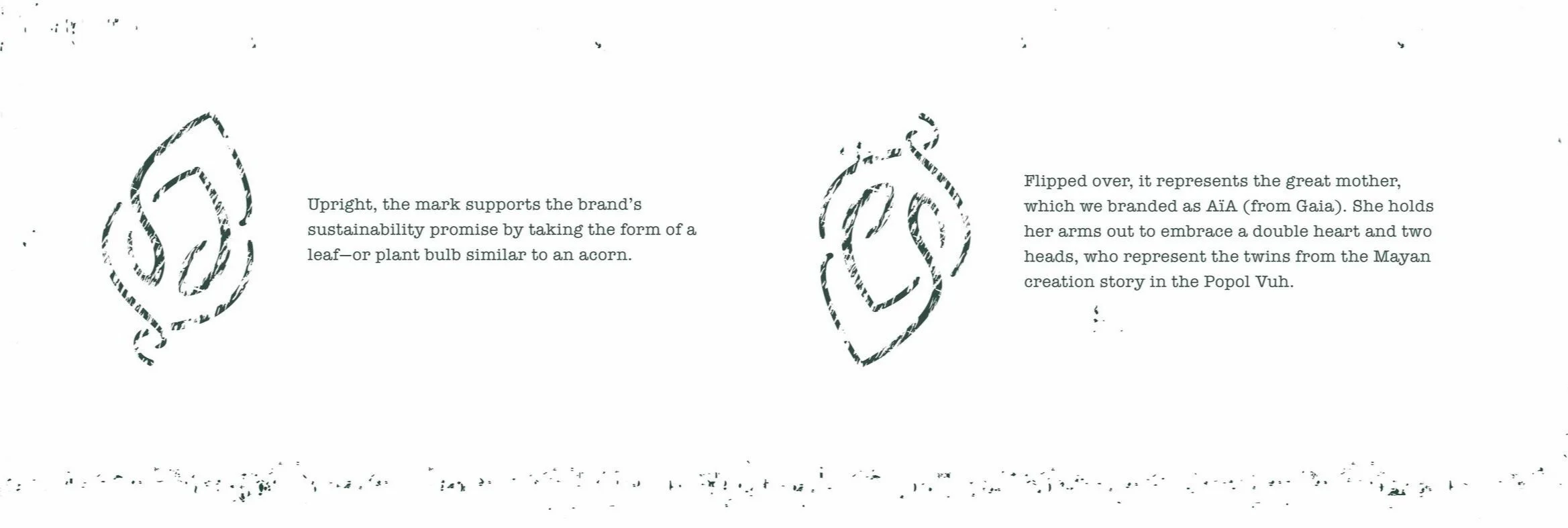


The Venus of Willendorf dates from circa 25,000–30,000 B.C.

The mark applied to a pendant designed by the hotel’s owner.
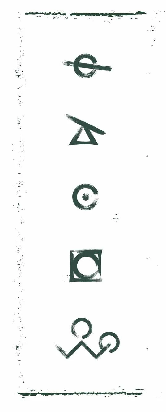
Cuneiform Symbols
We created a series of symbols to explore the brand through cuneiform, strengthening its association to ancient practices. We used a stroke style that is both on-brand and easy to replicate, so the in-house team could add more symbols as needed.


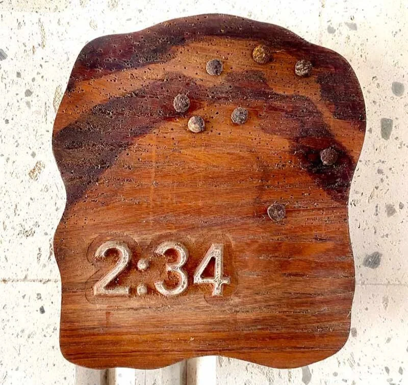
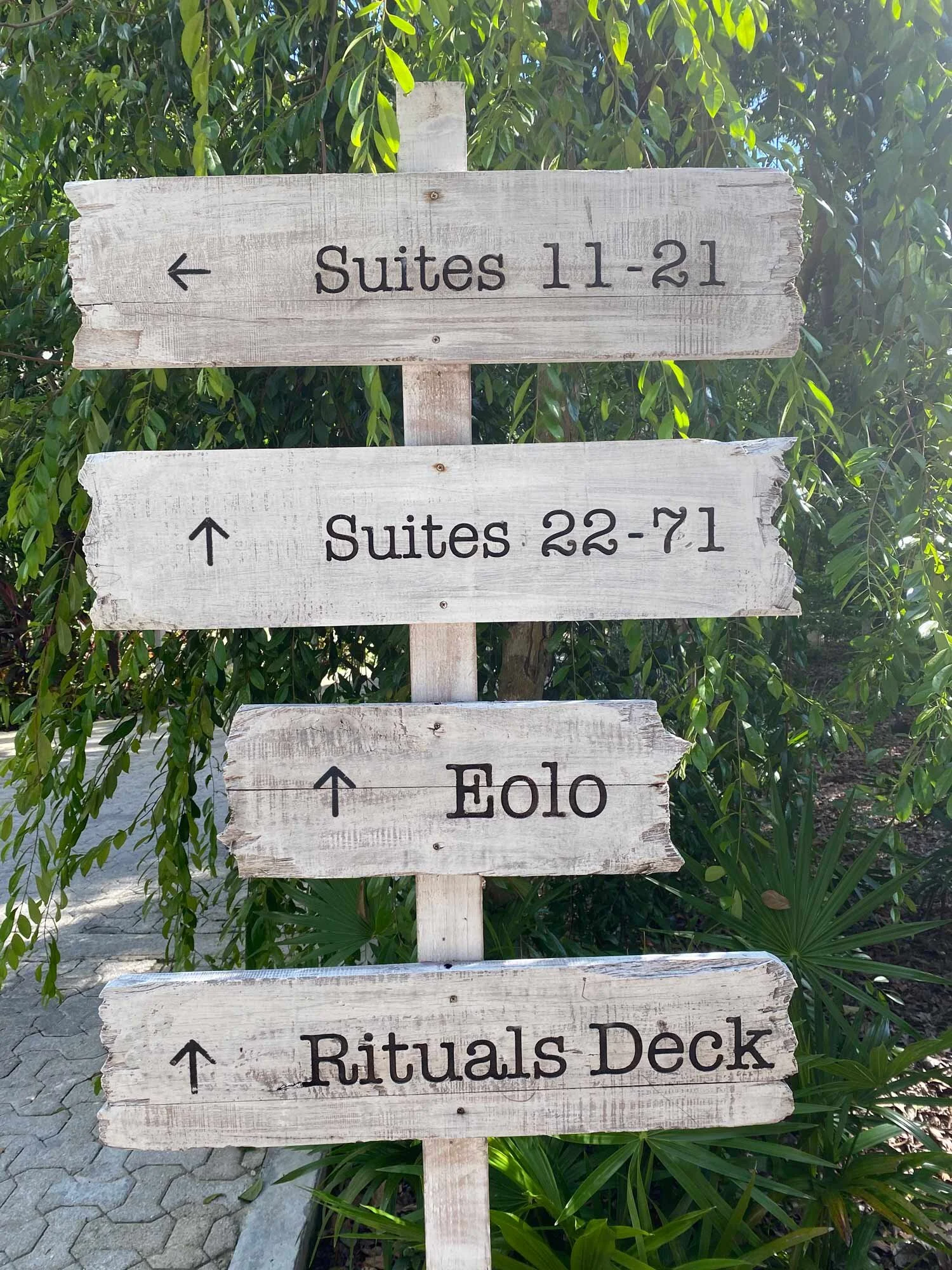
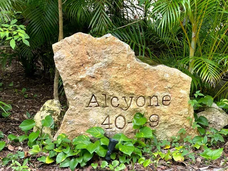
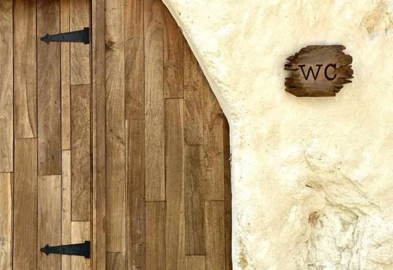
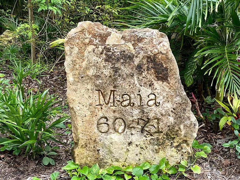
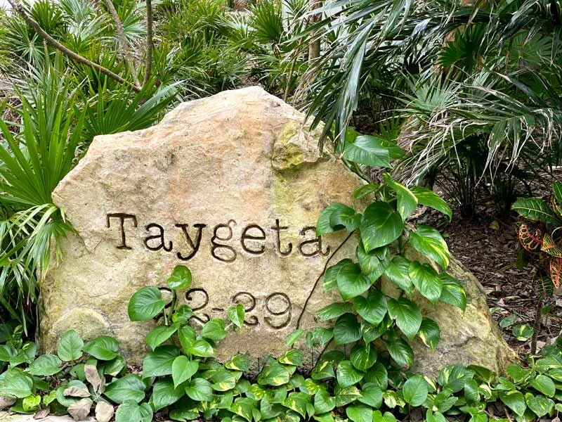
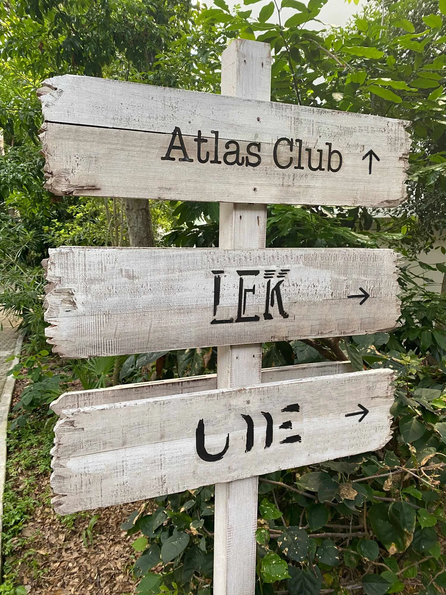
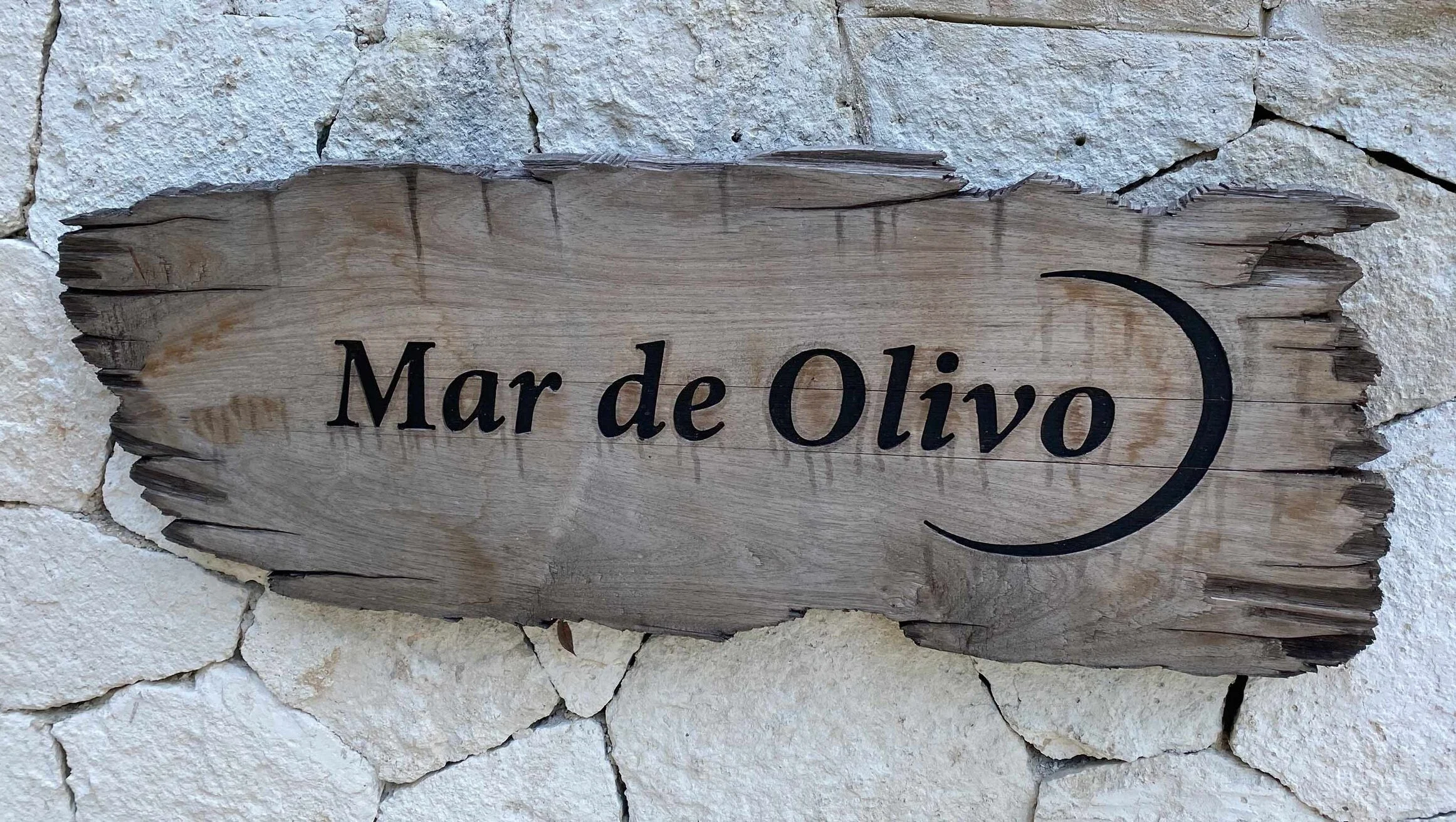
Logos & Signage
Logos for three on-property restaurants, room number signs, and typography treatments applied to signage.